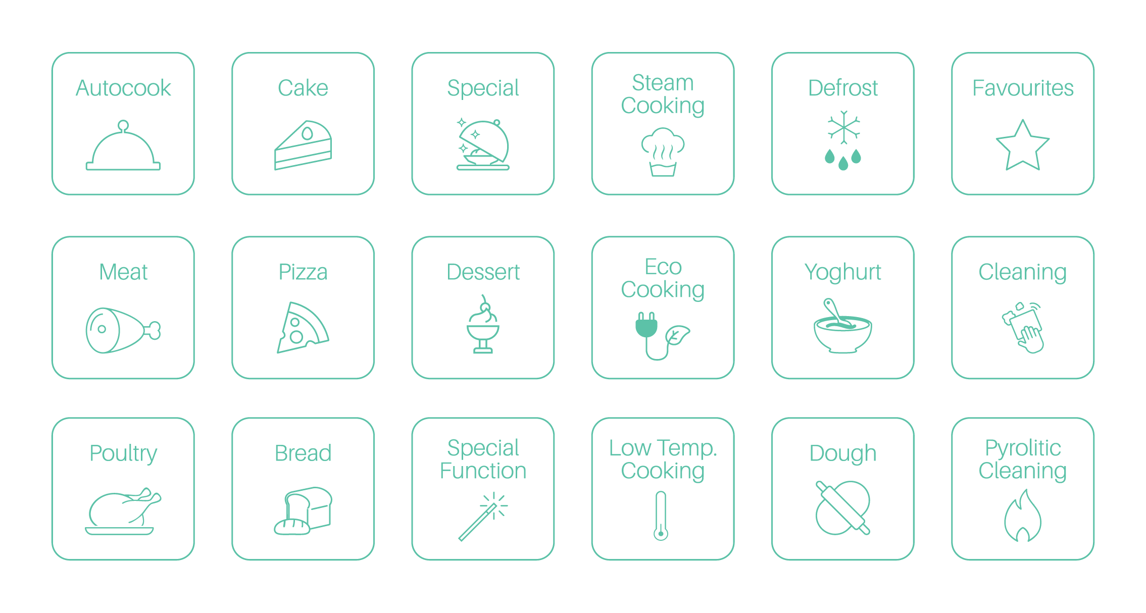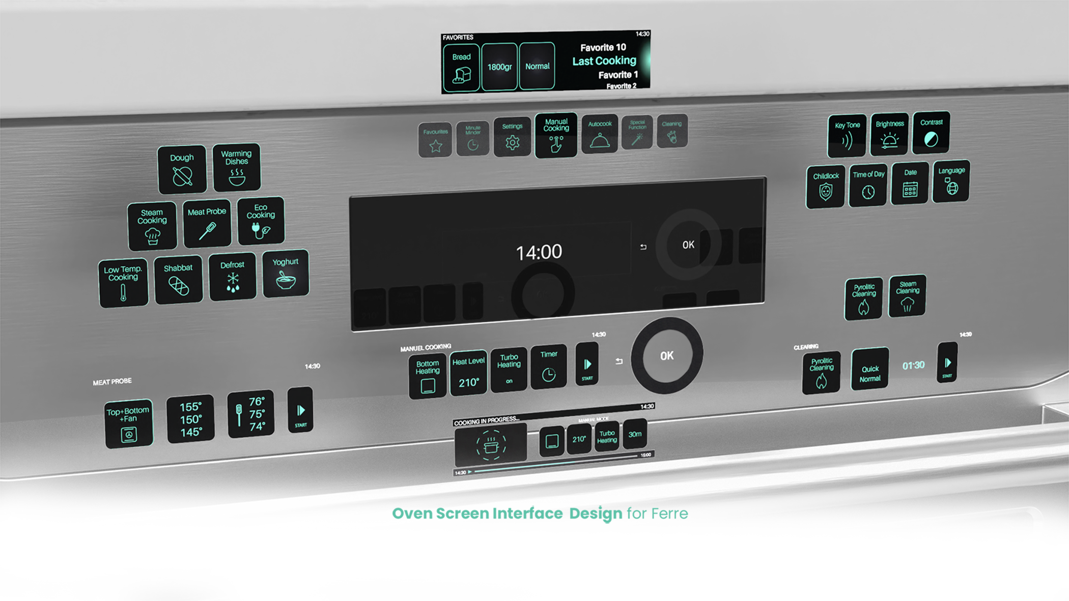

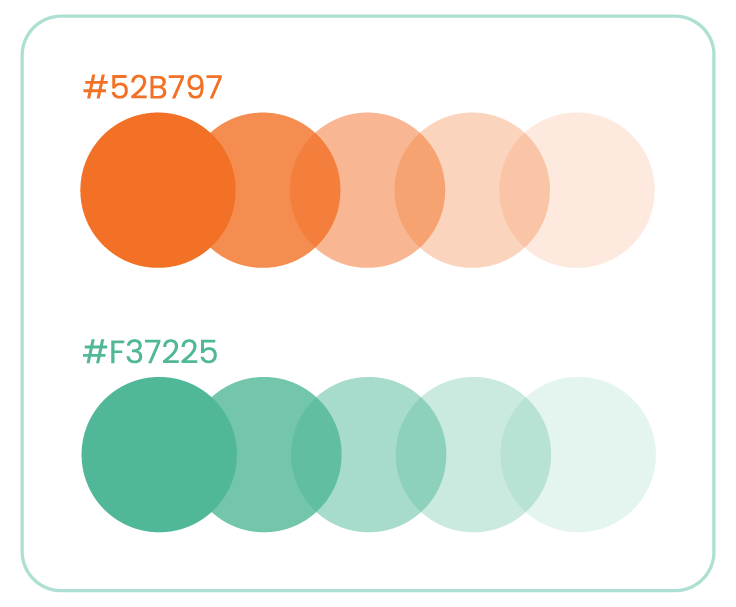
A new look of user interface panel design of Built-in Oven for Ferre. Neon green color was chosen to fit Ferre’s own corporate color which is the complement color of Ferre’s orange. Besides this, neon green is the colour of the future which was selected precisely to represent the vision of the company for the future.
The whole user experience is shaped around the wheel touch. Because of circular rotation movement, all display screens are designed to imitate the tangible circular motion. Thus, the end user perceives the screen as completed by itself and the user experience goes beyond the screen.

About Project
A new look of user interface panel design of Built-in Oven for Ferre. Neon green color was chosen to fit Ferre’s own corporate color which is the complement color of Ferre’s orange. Besides this, neon green is the colour of the future which was selected precisely to represent the vision of the company for the future.
The whole user experience is shaped around the wheel touch. Because of circular rotation movement, all display screens are designed to imitate the tangible circular motion. Thus, the end user perceives the screen as completed by itself and the user experience goes beyond the screen.
Work Flow
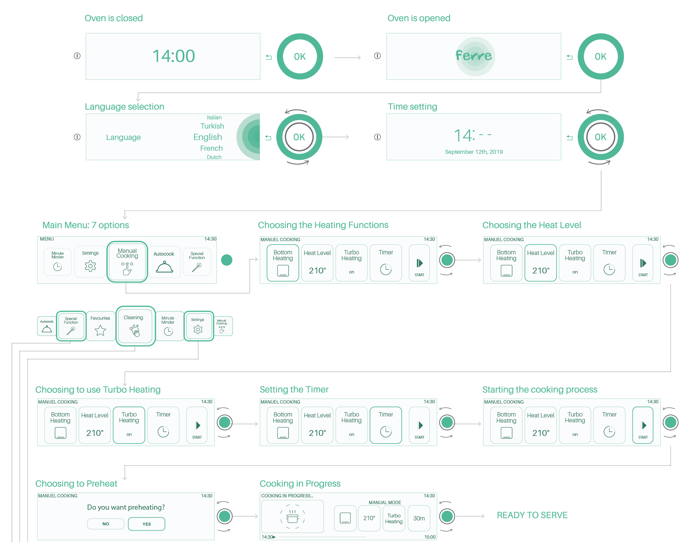
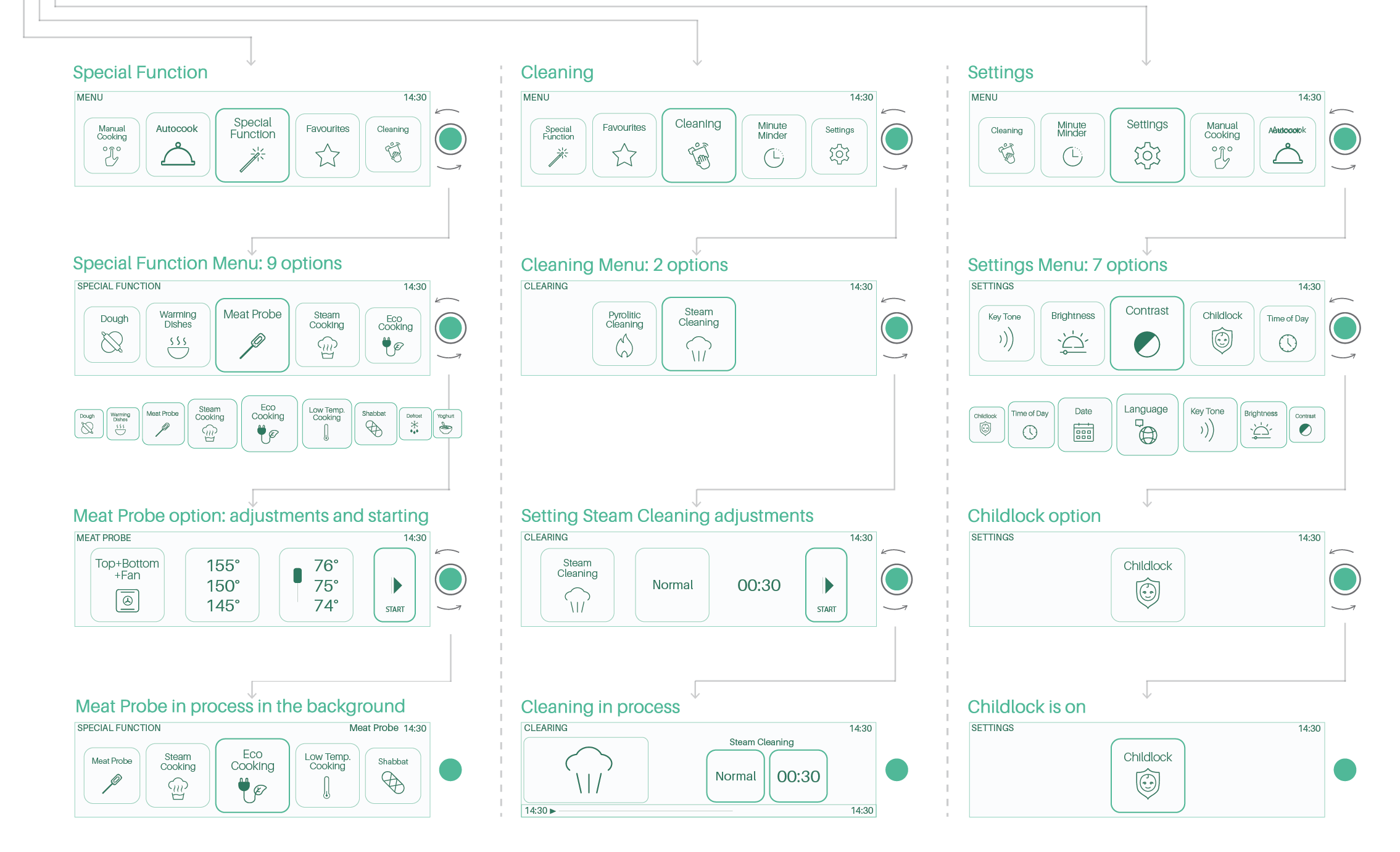
Work Flow


Colors
Colors

Icons

Icons
