
Every Form, a Letter. Every Product, a Word.

Formeta Design’s Visual Identity

Every form, a letter. Every product, a word.

This line became the starting point for Formeta Design’s visual identity. As the studio’s work expanded across products, interfaces and editorial publishing, we needed a system that could connect these different settings.

Connecting the Studio’s Work

Our work spans physical products, interfaces and editorial publishing. The identity connects these settings through a consistent visual structure.

A Shared Visual Structure

The phrase “Every form, a letter. Every product, a word.” guides how individual forms contribute to a larger visual language.

The Iconography Grid

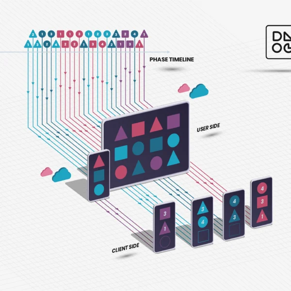
A custom iconography grid gives the identity a shared structure. Symbols represent services and ideas, while the same visual logic carries across the website, presentations, printed material and internal tools.

Across Print and Digital

The same structure appears on the website, in presentations, in printed material and in the studio’s internal tools.

A System That Can Grow

The system provides consistency without requiring every application to look identical. It can develop alongside the studio and the work we produce.

read more about us